My Little Pony
Climate Change. It’s a topic that’s been in the media recently for a number of reasons, namely because we’re experiencing it now. We know that because we have climate records going back to 800,000 years (possibly [1.5 million years]) from ice cores. The gases trapped in the ice are made up of the atmosphere that was around when the ice formed. The atoms that make up the gas, like oxygen, carbon, and hydrogen, have different values of positive and negative particles (different isotopes) that relate directly to the temperature the planet was at the time. That’s how we know what temperature the planet used to be and how we can plot the data and form predictions about what the future holds (spoiler alert: it’s gonna get hot). For more on that, watch the video at the bottom.
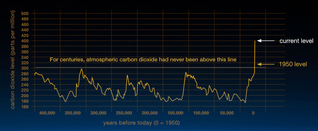
This graph shows carbon dioxide levels over time. The higher the level of carbon dioxide, the hotter the temperature. From NASA. Credit goes to Vostok ice core data/J.R. Petit et al.; NOAA Mauna Loa CO2 record.
A [paper] was published this week that analyzed these same isotopes from the past. The Earth has gotten hotter in the past. One of these times, called the Paleocene-Eocene Thermal Maximum (PETM, 56 million years ago) lasted for 200,000 years and caused the Earth to rise 5°-8°C over 10,000 years. (Note: we’ve risen [0.7°C over 100 years, which is about 10 times faster] than the natural warming cycles the planet has experienced.)
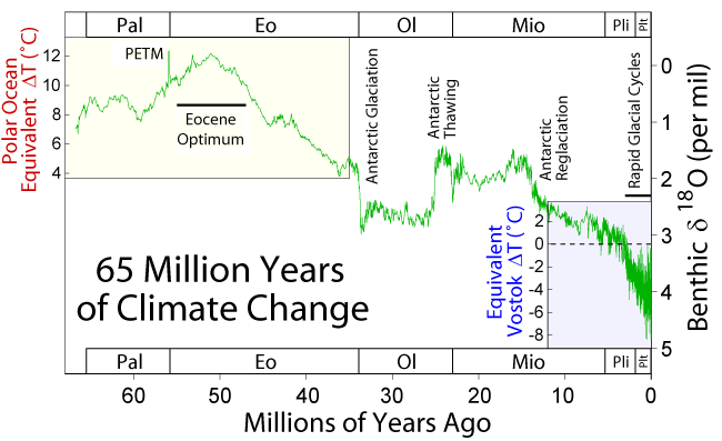
Lots of information in this graph. Here’s the breakdown. Time, in millions of years, is on the bottom (the x-axis) with present day on the right at 0 million years ago. The abbreviations above the time are for the names of the period (Pal = Paleocene, Eo = Eocene). Along the right, the y-axis shows the amount of a particular isotope of oxygen that tells us temperature. The green line in the graph is the amount of that isotope over time, and gives us a sense of temperature. The higher the line is the hotter the temperature, and the lower the line is, the cooler the temperature. Right between the Paleocene and the Eocene, you can see the spike that indicates a sudden hot temperature. You can also see the cooling trend that lead to the ice ages (“Rapid Glacial Cycles”).
This new study examined a time after the PETM (about 2 million years later, at 53.7 million years ago), called the Eocene Thermal Maximum 2 (ETM2). The record of this time is pretty complete in the Big Horn Basin of Wyoming. The authors analyzed the temperature before, during, and after the ETM2 using the isotopes contained in the soil and in the teeth of an early horse, Arenahippus pernix, and a couple of other mammal species. They also calculated the body size of these animals using the size of the first molar. Molar size corresponds well to overall body size in mammals, so we can use the molar size to estimate body size when we only have teeth.
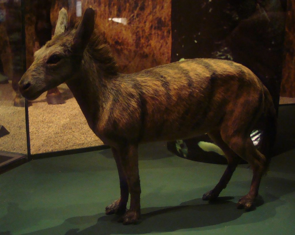
Arenahippus pernix at the Swedish Museum of Natural History. From Wikipedia.
The authors found that as temperature increased, the size of the horse shrank (from 7.7 kg to 6.6 kg). As temperature fell again after the ETM2, body size increased (from 6.6 kg to 7.9 kg). One of the reasons for this shrinkage is that it’s easier to cool off a smaller body than it is to cool off a larger body. If the environment is warming up, then being able to cool off faster is an advantage. Also, there may have been fewer nutrients available if droughts were happening, so the horses may not have been able to grow to their full size. The last reason could be related to how much rain was available. Less rain means less plants and less food for herbivores. Whatever the reason or combination of reasons, what we do know is that climate change, like what we’re seeing now, will affect mammals in ways we are still discovering.
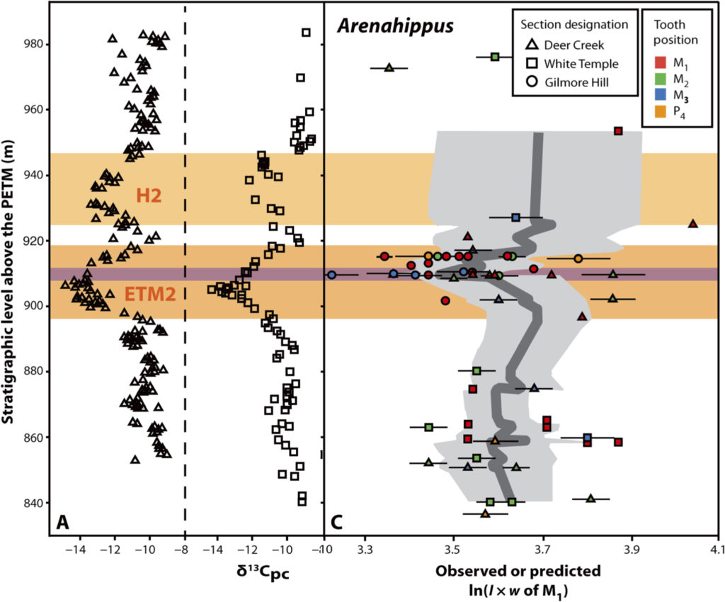
Figure 3 (A and C) from the paper. The first two columns show the carbon isotope levels in the soil through time. The further the points move to the left, the hotter the climate was. The right column shows molar size in Arenahippus. Points to the left are smaller molars and points to the right are larger molars. The molars get smaller just as temperature is the hottest, and then grow again when the climate cools down.
Video on atmospheric carbon dioxide from the Earth System Research Laboratory at the National Oceanic and Atmospheric Administration. More sources can be made available on request.